To better understand the HSV and RGB colorspaces, it helps to understand their relationship. A very useful exercise is to identify the parts of the RGB cube that correspond to surfaces of constant hue, saturation, and value.
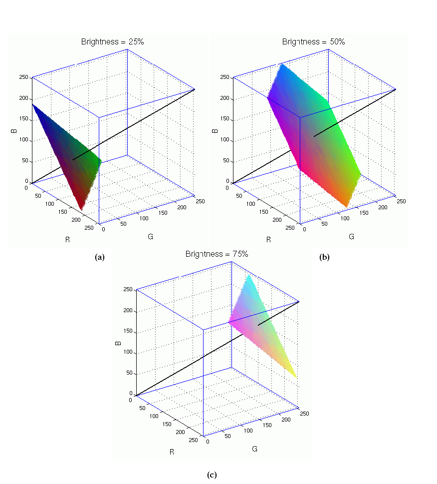
We begin by better defining brightness. This term was introduced in the previous section, and it is a measure of the visual perception of how much light an area is emitting. A lamp with a variable control switch allows the level of brightness to be changed. Turning the lamp up increases our perception of brightness. Note that the notion of brightness does not depend on the color of the light. It makes as much sense to talk about the brightness of a red lamp as it does a white one.
A color monitor is just a collection of thousands of lamps (that is,
pixels) that emit red, green, and blue light. Because each of the
lamps can be independently controlled, the total brightness of an area
on the monitor is the sum of brightness from each color. Colors of
equal brightness in the RGB cube, then, are those whose three color
components sum to the same value. For a particular level of
brightness, this represents a plane perpendicular to the neutral axis
(that is,
![]() ). Figure 5.5
). Figure 5.5
There are many concepts closely related to brightness and that have various useful properties. Brightness is formally defined to be (R+G+B)/3; it is a physical property of color and does not correspond well to human color perception. For this reason, brightness is not actually used in the GIMP. However, the GIMP does use
Figure 5.6
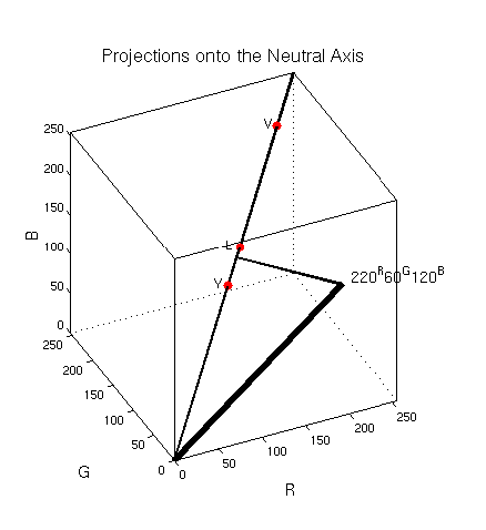
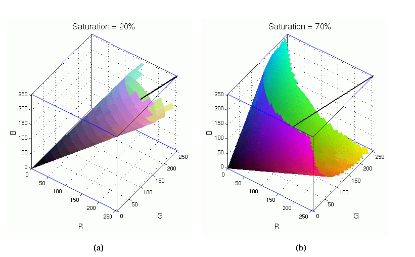
Next, we define saturation. The definition of saturation is related to that of brightness. Saturation is the relative colorfulness of an area with respect to its brightness. What is colorfulness? An answer can be given in the context of the RGB cube and the neutral axis. As already noted, the neutral axis is the diagonal in the cube going from 0R 0G 0B to 255R 255G 255B, and which consists of black, white, and the grayscale between them. Thus, in the usual sense, this axis has no color (that is, hue). The colorfulness of any point in the RGB cube, then, is proportional to its perpendicular distance to the neutral axis. Points closer to the axis are less colorful (that is, closer to gray) and those that are further away are more colorful. The saturation, then, of a point in the RGB cube is the ratio of its colorfulness to its brightness.
This means that surfaces of constant saturation in the RGB cube are
cones centered around the neutral axis.
Figure 5.7
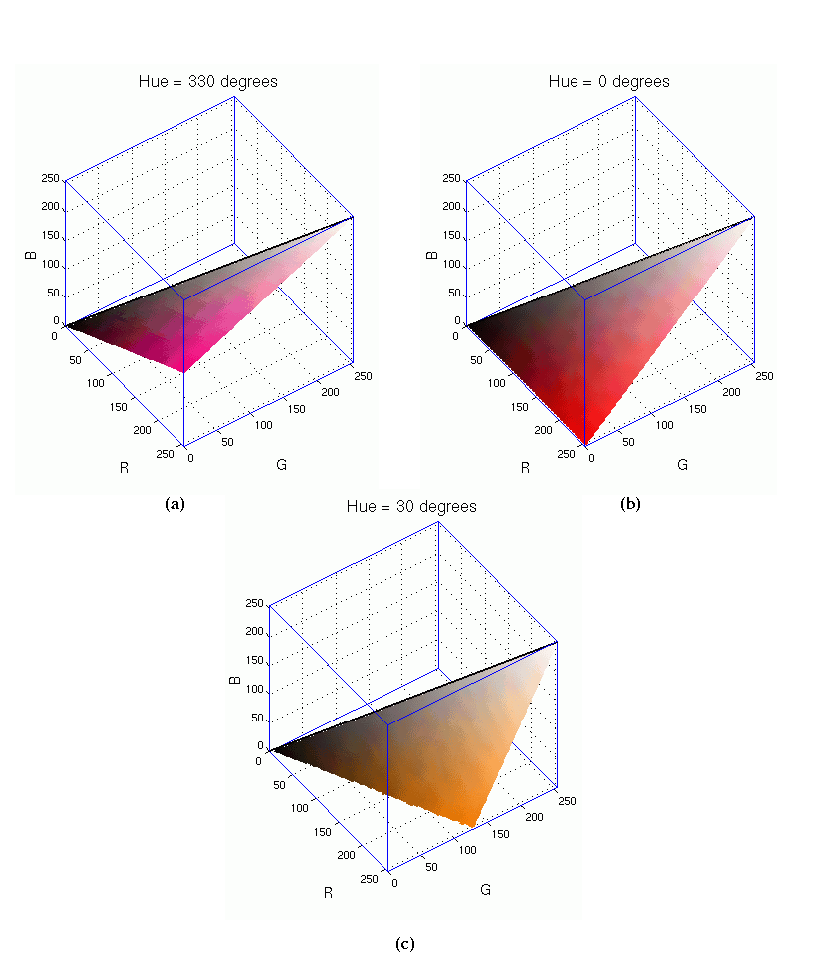
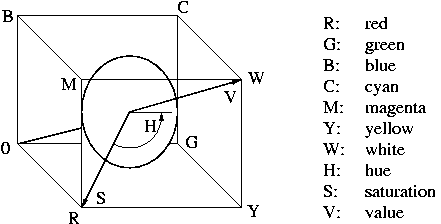
Finally, the definition of hue is related to what we colloquially think of as color. The hue of a point in the RGB cube is defined to be its angular position around the neutral axis. Looking at the corners of the RGB cube shown in Figure 5.2, you can see that red, yellow, green, cyan, blue, and magenta are distributed equally in angle around the neutral axis. Thus, the wedge defined by the neutral axis and any point on the surface of the cube is a plane of constant hue.
Figure 5.8
Figure 5.9
With the HSV coordinate system in mind several observations can be made about regions of color in the RGB cube. The first is that the cyan, magenta, and yellow vertices of the cube represent brighter colors than red, green, and blue because these latter project lower down onto the neutral axis. Similarly, all colors in the pyramid defined by the C, Y, M, and W vertices correspond to lighter colors, and the pyramid defined by the origin and the R, G, and B vertices correspond to darker colors. Colors near the neutral axis in the cube will have a more pastel or washed out look because they are less saturated, and colors further away from this axis will appear more vivid.