A color cast occurs when the Red, Green, and Blue channels of an image are not properly balanced. The cast can be across the entire range of pixel values or can limit itself to the highlight, shadow, or midtones of the image. Color casts are common in photographs. They occur because, under certain circumstances, the sensitivity of film to color is different than the sensitivity of the human eye. The film just doesn't record the same scene as your eye.
Removing color casts requires being able to identify where the color in an image has gone wrong. I often have a hard time telling, simply by looking at an image, if it is suffering from a color cast. This is due to many reasons. First, color is a perceptual issue that is strongly affected by surrounding light conditions. Second, the representation of color varies from one computer monitor to another because settings such as brightness, contrast, gamma, and color temperature can be quite different. Furthermore, the ability of a monitor's phosphors to create levels of red, green, and blue light will differ from monitor to monitor and change over time as the monitor ages.
All this makes the perceptual evaluation of color casts difficult for the average person. Fortunately, the GIMP provides some analytical and interactive tools for determining whether color casts exist and for correcting them. There are several techniques for identifying, measuring, and correcting color casts. Each approach uses the powerful Curves tool which is reviewed in the first part of this section.
The Curves tool is found in the Image:Image/Colors menu.
Figure 6.8
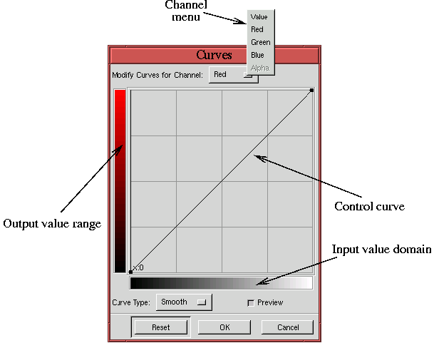
The main elements of the tool consist of an input value domain, an output value range, and a control curve drawn on a graph. The graph has a grid divided into quarters, and the range of values is from 0 to 255. Thus, the value of each grid line, moving horizontally from left to right, is 0, 64, 128, 192, and 255. The values moving vertically from bottom to top are the same.
The control curve represents a map of the input value domain to the output value range. That sounds pretty abstract! What good is mapping input to output values? The executive, top-level answer is that curve mapping of input to output values is the most powerful color correcting tool in the GIMP, and learning how to use it is definitely worth your while. More about mapping input to output values and what it's good for in a moment...
Figure 6.9
Every control curve has two default control points located at the curve's upper right and lower left. These can be moved just like user-created control points. All control points except the defaults can be removed by clicking on the Reset button in the dialog. If many control points have been positioned and a single one needs to be removed you can remove it by dragging it with the mouse to the left or right edge of the dialog. This pulls the control point right off the curve.
The Curves tool also has an Information Field that interactively indicates the X and Y positions of the mouse cursor whenever it is in the graph area of the dialog. This field is located in the upper-left corner of the graph area, and, as you will see, this information is essential for performing precise color correction. But first, it is important to get an intuitive feel for how the Curves tool works.
Figure 6.10
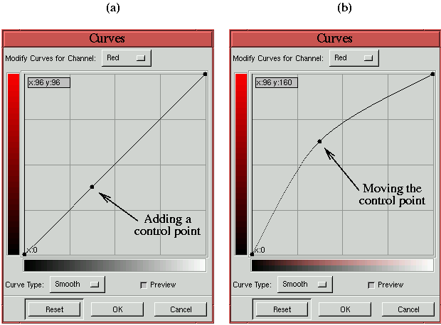
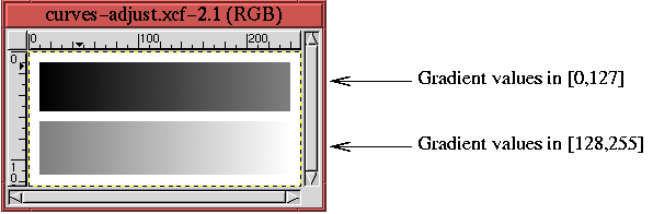
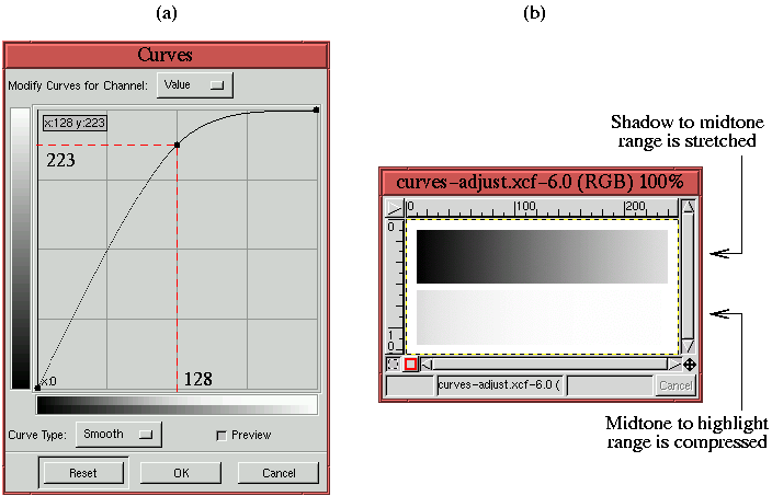
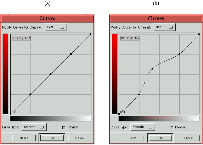
The following illustrates how the Curves tool is used to change
the tonal range of these two gradients.
Figure 6.11(a)
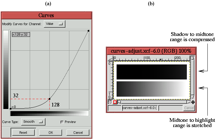
This means that all the pixels that had values in 0 to 128 in Figure 6.10 are compressed to a new range of 0 to 32. Thus, much of the detail and contrast between neighboring pixel values in this range is lost. This effect can clearly be seen in the upper gradient in Figure 6.11(b), which is the result of applying the curve in Figure 6.11(a) to the image in Figure 6.10. Simultaneously, the pixel values in the domain 128 to 255 are stretched to a new range of 32 to 255. Consequently, the contrast of the detail of these pixels is increased, as you can see in the lower gradient in Figure 6.11(b).
A similar analysis can be made for
Figure 6.12,
The conclusion that can be drawn from these two examples is that the Curves tool can be used for two things. First, ranges of pixel values can be remapped. This is particularly valuable when a color channel is out of balance with the others. When color imbalances occur, we will try to measure which range is out of balance, determine what the range should be, and use the Curves tool to remap one range to the other. This approach is developed in detail in Section 6.2.2.
The second use is to improve contrast where it is most needed. Often an image has a subject that is much more important than the rest of the image. When this is the case, it is desirable to give the subject the most detail and contrast possible. From the examples, you can see that the Curves tool can be used to improve contrast. Note, however, that in improving the contrast in one range of values, there must simultaneously be a loss of detail and contrast in the complementary range of values. This was clearly demonstrated in Figures 6.11(b) and 6.12(b). Fortunately, improving the contrast of the subject while simultaneously impoverishing the contrast of the background is typically what we want to do. This draws the viewer's eye to the part of the image we most want to convey. The idea of improving subject contrast is developed more in Section 6.2.6.
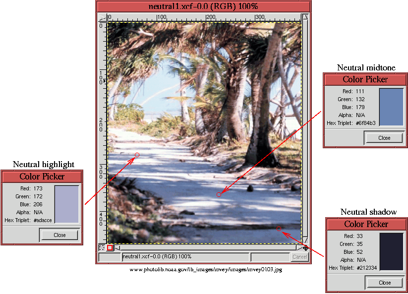
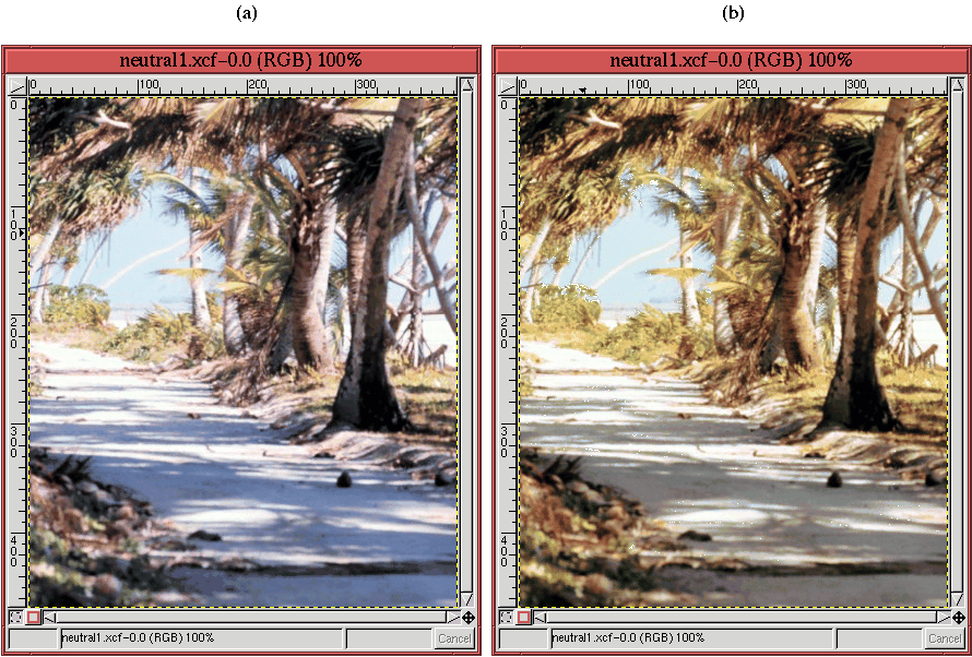
A powerful method for identifying color casts is to measure the color of pixels that, in principle, should be neutral gray. Neutrals must have equal components of red, green, and blue. If they don't, that indicates the presence of a color cast, and you know that a color correction must be made.
Figure 6.13
There are a wide range of values for the shadow along the path, and it is possible to measure dark, mid-range, and light shadow values. In Figure 6.13, these are referred to as shadow, midtone, and highlight neutrals, and their values, measured with the Color Picker, are shown at three different points. (The Color Picker is located in the Toolbox and is represented by the eye-dropper icon.) Measuring color in an image with the Color Picker displays the color in a rectangular patch in the Color Picker dialog and gives its R, G, and B values. Measuring a color with the Color Picker also has the effect of setting the Active Foreground Color patch, in the Toolbox window, to the measured color.
For the three measured pixels shown in Figure 6.13, you can see that there is a distinct blue tinge for each one. Not only do the color patches shown in the Color Picker dialog look blue, the measured R, G, and B values show that there is a significant deviation of the blue values from the red and green ones--too much for the color of these pixels to be neutral. Using the color notation introduced in Section 5.1, the color patches shown in the Color Picker dialogs have the values 33R 35G 52B for the shadow, 111R 132G 179B for the midtone, and 173R 172G 206B for the highlight. The measured R, G, and B values for each point clearly indicate that there is too much blue.
It is true that shadows sometimes appear blue. However, this is usually true in winter away from the equator and is due to the natural filtering of the sun's rays by the earth's atmosphere. The blue color cast measured in Figure 6.13 is more likely due to the tendency of film, especially slide film, to produce blue casts when photographing under natural sky light. In any case, at an equatorial location on the earth, we would expect the fuller spectrum of the sun's light to create neutral shadows when these are seen on a neutral background.
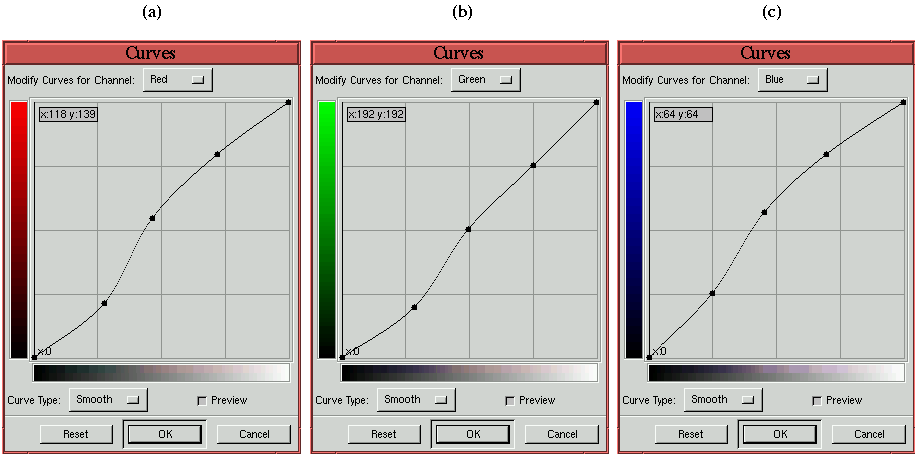
In addition to the blue cast, there may also be a slight red deficiency in the midtone range. In the following discussion the blue color cast and the red midtone deficiency are corrected using the Curves tool.
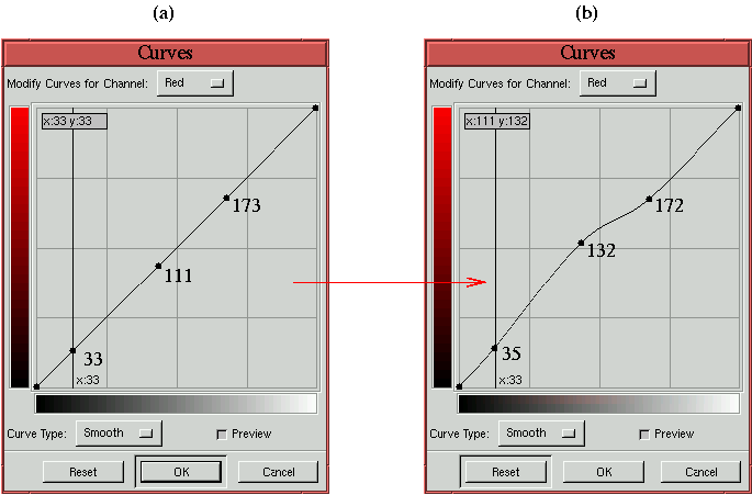
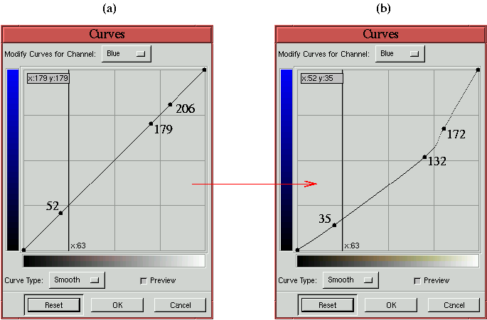
Figures 6.14
Again, the goal in displacing the control points is to make each of the measured pixel values neutral. This means making their red, green, and blue components equal. In this example, this is accomplished by moving the red and blue control points so that their values are made equal to the measured green values. The accurate repositioning of the points is made possible by the position Information Field displayed in the upper-left corner of the graph area. Note that the numbers positioned near the control points in Figures 6.14 and 6.15 are not a feature of the Curves tool; they are placed there to clarify the procedure.
Thus, on the red control curve, the shadow, midtone, and highlight values are moved from 33, 111, and 173 to the measured green values of 35, 132, and 172. On the blue control curve, the shadow, midtone, and highlight values are moved from 52, 179, and 206, again, to the green values of 35, 132, and 172. After the operation, the color values for the three measured pixels are 35R 35G 35B for the shadow, 132R 132G 132B for the midtone, and 172R 172G 172B for the highlight--all three neutral grays.
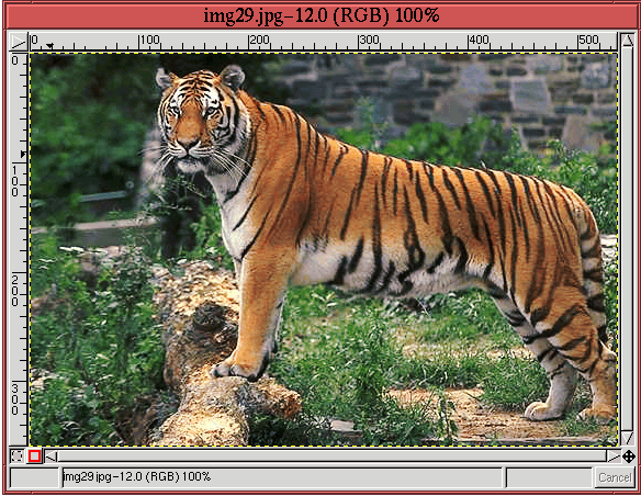
The result of color correcting the neutral pixel values is shown in
Figure 6.16(b).
There are some practical questions about the color correcting procedure just described. The first is, why were the blue and red channels matched to the green? For the three measured pixels there are a total of nine ways to make the three neutral. However, in practice, it is typical that two of the channels are almost the same and that one is quite different. When this is the case, as it is for the the measured shadow and highlight values in the preceding example, the choice is clear. When it is not the case, some experimentation may be necessary.
The second question about the procedure is, why measure three points? The method doesn't require three points and, amazingly, often a single point can suffice to color correct the entire image. However, matching a shadow, midtone, and highlight image point provides additional insurance that the color in each range is properly balanced.
The Curves tool has several features that facilitate the positioning of points on the control curves. Clicking the mouse button in the image window produces a vertical bar in the graph area of the Curves tool. The bar position corresponds to the pixel value the mouse cursor is over in the image window. Clicking and dragging the mouse button interactively updates the position of the vertical bar. In this way, it is possible to see where different pixel values in the image are located on the control curve and helps to discover the locations of shadow, midtone, and highlight pixels. In addition to input position information, Shift-clicking in the image window automatically creates a control point on the curve in the active channel of the Curves dialog. Control-clicking on a point in the image window produces control points on each of the Red, Green, Blue, and Value control curves.
In addition to the Curves tool features, a very useful tool for exploring and discovering color problems in an image is the Info Window dialog. This dialog is found in the Image:View menu and can also be invoked by typing C-S-i in the image window. The Extended tab of this dialog interactively reports the R, G, and B pixel-color components when the mouse is in the image window. The advantage of the Info Window over the Color Picker for measuring pixel values in the image window is it remains open while using the Curves tool.
There are two lessons to be learned from this section. First, color correction can be very easy. Measuring only a few pixel values across the shadow to highlight range can color correct an entire image in a few minutes time. Second, the color correction obtained in this way not only fixes the individual measured pixels but usually corrects the entire image. Third, the Curves tool is the only one which can be used to correct the image based on measured pixel values. For these reasons, the Curves tool is the most precise and the most powerful tool for color correction in the GIMP.
To do color correction using the techniques of the previous section,
it is important to be able to identify shadow, midtone, and highlight
colors. To be frank, I sometimes have difficulties finding them for
some images. When this happens, the Threshold tool is useful
because it can show where any range of values is hidden in an image.
The Threshold tool is found in the Image:Image/Colors
menu. Figure 6.17
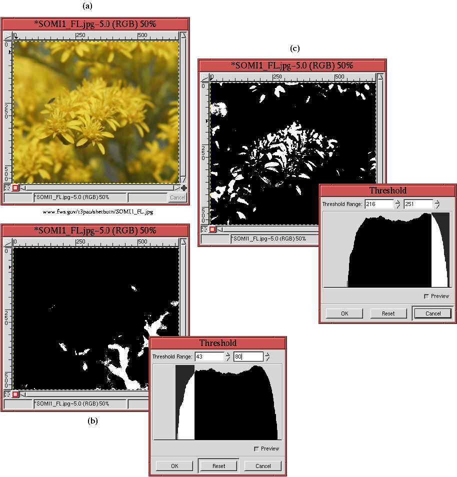 |
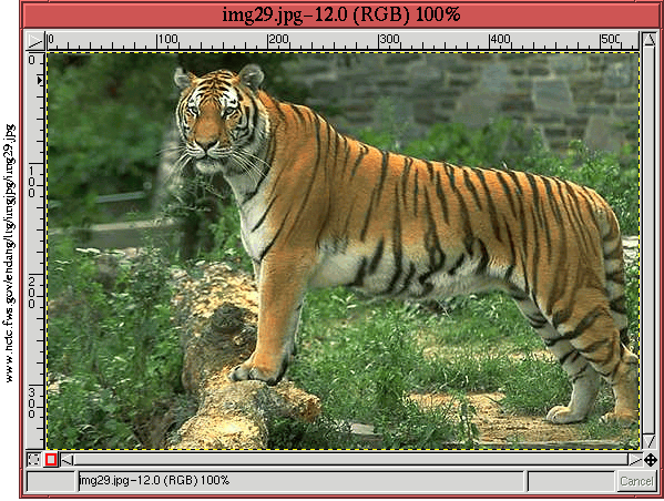
Figure 6.17(a) illustrates an image and Figures 6.17(b) and (c) show how to use the Threshold tool to identify its darkest shadows and lightest highlights. The Threshold tool, which was introduced in Section 4.5.3, consists of a dialog that displays the histogram of the image's pixel values. Clicking and dragging the mouse through a range of histogram values has the effect of mapping all the pixel values in the image to either black or white. The image pixel values corresponding to the selected histogram range become white, and the rest become black.
In this way, it is easy to localize the pixel values we are searching for. Starting with an image like the one in Figure 6.17(a), a duplicate of the image is made by typing C-d in the image window. Then, the Threshold tool is applied to the duplicate, and a range of shadow values is swept out with the mouse, as shown in Figure 6.17(b). The resulting white pixel values in the duplicated image window show the locations of the darkest shadows. Using the duplicated image as a guide, the Color Picker can now be used in the original image window to measure pixel values at the appropriate locations. A similar procedure is used to accurately find and measure the lightest highlights of the image using the duplicated image shown in Figure 6.17(c).
Note that this procedure, using the Threshold tool to find value ranges in the image, can also be used on the image's individual RGB components. The decomposition is made using the Decompose function, found in the Image:Image/Mode menu (see Section 4.5.3).
If there are identifiable colors other than neutrals in an image, these, too, can be used to perform color correction. Examples are the colors of flags, logos, or certain animals. A Canadian flag whose famous maple leaf emblem were not red would be a good point of reference for color correction.
Another important class of colors that can be found in many images are fleshtones. A medium Caucasian fleshtone has a green around 192, a red that is about 20% more (234), and a blue about 10% less (176). Darker skinned people have skin colors with more blue and less red, and Asians have less blue. Because of the variability of skin tones, relying on them as guides is more uncertain than using neutrals. Nevertheless, for some images this may be the only point of reference available for color correction.
Sometimes it is impossible to positively identify a color in an image but it seems clear that a color cast is present. This means there are no color references that can be used to do color correction. Under these conditions, an alternate approach is needed. The method proposed here is what I call the perturbation technique. It relies on the visual feedback that the preview checkbox in the Curves dialog provides. In a nutshell, the method makes incremental perturbations to the shadow, midtone, and highlight regions for each of the red, green, and blue curves. The perturbations that improve the image are kept and those that do not are discarded.
Figure 6.18
 |
Note that, in moving the midtone control point, the only parts of the curve that move are those between the shadow and highlight control points. The rest of the curve is constrained by the two other control points. This is very useful because it allows the Curves tool to act on a select part of the image's tonal range.
The perturbation technique is not scientific and relies on the perceptual abilities of the user to see changes that improve or deteriorate an image. Nevertheless, cycling among the nine control points, making only gradual changes to each, can often produce marvelous results. The following example illustrates this approach.
Figure 6.19
The perturbation technique is an approach to color correction that
requires experimentation. Thus, the steps are difficult to present in
book format. The best that I can do is to show you the results. For
this, Figure 6.20
There is an important caveat to the perturbation technique. Because this method relies on the visual feedback you get from your monitor, the technique is highly dependent on the monitor's individual characteristics. What looks great on your monitor might not look as great on another. The method described earlier in this chapter that measures pixel values and then makes adjustments accordingly does not depend on the monitor. The earlier method is the preferred approach whenever possible.
Sometimes one part of an image is more important than the rest. We often refer to this part of the image as the image subject. It is typical to want the subject to have as much contrast as possible. This makes the subject stand out and look much more interesting. As was discussed in Section 6.2.1, the Curves tool can be used to improve the contrast of certain parts of the tonal range in an image. This can be applied to the subject of the image by determining its lightest highlight and deepest shadow and then steepening the part of the control curves covering this range.
However, if a lot of work has already gone into maximizing tonal range and correcting color, you might be reticent to play with the curves to get additional contrast into the subject. Clearly, manipulating a part of the curves in an attempt to improve contrast can damage the color balance obtained with much hard work.
Fortunately, there is a way to have your cake and eat it too. Up to this point, the red, green, and blue control curves have monopolized our attention. As you have already seen, modifying any of these changes the overall balance of color in the image. However, the Curves tool can also be used to modify the image's Value channel. As discussed in Section 5.3, the Value channel has no effect on color; it only affects brightness. This, then, is the perfect channel for improving contrast while preserving the image's color balance.
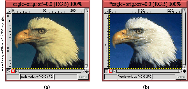
To illustrate the use of the Value channel to improve
contrast,
Figure 6.22(a)
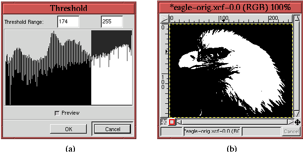
To improve the contrast of the head feathers, it is necessary to
determine the value range that this part of the image is contained
in. The Threshold tool is perfect for this (see
Section 6.2.3).
Figure 6.23
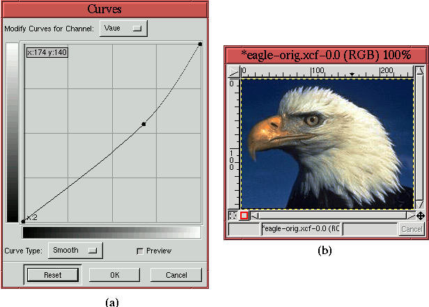
The value range determined with the Threshold tool is noted, and
the tool is then canceled. The next step is to invoke the Curves tool and to improve the contrast of the Value channel curve
using the range determined using Threshold.
Figure 6.24
The result of applying the curve shown in Figure 6.24(a) is shown in Figure 6.24(b). Comparing this result to the image in Figure 6.22(b) shows that the contrast of the eagle's head feathers has been significantly improved. As a final, practical note, the amount that the Value curve is steepened is determined experimentally by moving the control points on the curve and evaluating the effect on the image.
The GIMP has several other color correcting tools. These all live in the Image:Colors menu and their names are Color Balance, Brightness-Contrast, and Hue-Saturation. In this book, these tools are not covered in detail, and for good reason. Although they can be used for touchup and enhancement, these tools are like working with a dull knife, especially when compared to the Curves tool, which has the precision of a surgeon's scalpel. Let's see why.
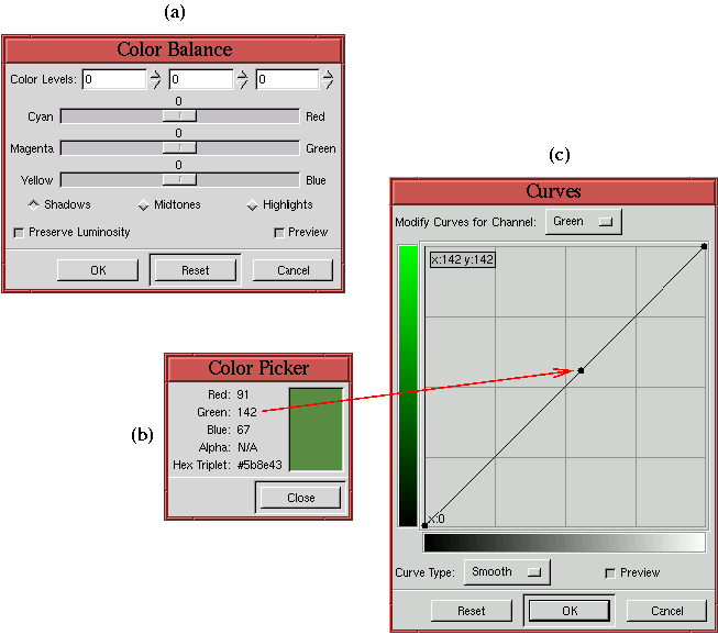
Figure 6.25(a)
The Curves tool can do anything the Color Balance tool can, but better. The reason Curves is more powerful is that the Color Picker can be used to identify exactly which input values need color balancing. The Color Picker is shown in Figure 6.25(b), and it is displaying a value for a measured pixel in an image. This value can be precisely placed and manipulated in the Curves tool. Figure 6.25(c) shows how a control point, corresponding to the green component of the measured pixel, has been placed on the Green channel curve. This placement of a control point, corresponding to a measured pixel value, permits the subsequent, precise correction of color balance at this point. By comparison, the Color Balance tool only allows for the gross selection of input regions (shadow, midtone, and highlight) and is incapable of performing the precision color corrections described in detail in Section 6.2.2.
The conclusion is that the Curves tool is much more precise and versatile than the Color Balance tool.
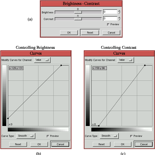
Figure 6.26(a)
Thus, brightening or darkening an image using the Brightness slider has the effect of diminishing tonal range because the result maps the input value domain to a smaller output range. From the discussion in Section 6.1, this is clearly a disadvantage. The Curves tool, on the other hand, can be used to increase or decrease brightness without loosing tonal range. To brighten an image place a control point on the Value curve and displace the point upwards. This brightens the image without losing tonal range. To darken the image drag the point downwards.
Figure 6.26(c) also shows the Value channel of the Curves tool. Here, the curve has been rotated counter-clockwise around the center of the input-output dialog. This has the effect of increasing contrast in the midtones of the image. However, it simultaneously eliminates detail in the shadow and highlight ranges. This action is exactly what the Brightness-Contrast tool does when the Contrast slider of the dialog is moved to the right. Moving the slider to the left corresponds to rotating the curve in the clockwise direction.
The conclusion is that the Curves tool performs much better than the Brightness-Contrast tool.
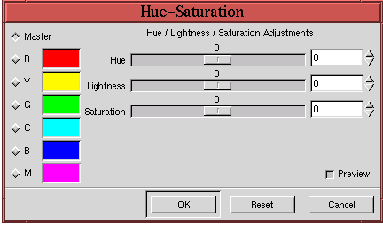
The Hue-Saturation dialog is shown in
Figure 6.27.
The reason Hue-Saturation is not useful for color correction is that it is difficult to know how to make adjustments with it to enhance an image. With the Curves tool, the measurements made with the Color Picker can be used to make precise changes that will result in predictable improvements to an image. By contrast, there is no way to measure what is wrong in an image in a way that can then be used to make precise corrections with the Hue-Saturation tool. Furthermore, as has already been pointed out, color problems are rarely uniform over the shadow, midtone, and highlight regions. The Hue-Saturation tool has no capability for varying color components in different ranges of the image.
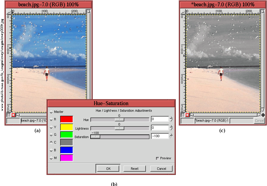
Thus, for color correction, the Hue-Saturation tool is of little
use. Nevertheless, unlike Color Balance and Brightness-Contrast, the Hue-Saturation tool can be used to do
useful and interesting things that would be difficult to do with any
other color tool. Figure 6.28
Figure 6.28(a) displays a beach scene consisting of vivid colors, and Figure 6.28(b) shows the Hue-Saturation dialog where the Saturation slider for the Cyan radio button has been adjusted to -100%. The result, shown in Figure 6.28(c), is to completely desaturate the sky and water, while leaving the color of the beach untouched. Similarly interesting modifications can be made with the Hue and Lightness sliders. Try experimenting!