2.4. GUI Elements

KSimpleApp minimally uses each of the four widgets that are managed by KTMainWindow. They are all created and configured in the KSimpleApp constructor, shown in Listing 2.5.


Example 2.5. ksimpleapp.cpp: The Class Definition File for KSimpleApp

   1 
   2  1: #include <qlabel.h>
   3  2:
   4  3: #include <kstdaccel.h>
   5  4: #include <kiconloader.h>
   6  5: #include <kmenubar.h>
   7  6: #include <kapp.h>
   8  7: #include <kaction.h>
   9  8:
  10  9: #include "ksimpleapp.moc"
  11 10:
  12 11: KSimpleApp::KSimpleApp (const char *name) :
  13 12:   KTMainWindow (name)
  14 13: {
  15 14:   KAction *reposition =
  16 15:     new KAction ("&Reposition Text", QIconSet(BarIcon ("idea")),
  17 16:             CTRL+Key_R, this, SLOT (slotRepositionText()),
  18 17:             this);
  19 18:   KAction *quit =
  20 19:     new KAction ("&Quit", KStdAccel::quit(), kapp,
  21 20:             SLOT (closeAllWindows()), this);
  22 21:
  23 22:   QPopupMenu *filemenu = new QPopupMenu;
  24 23:   reposition->plug (filemenu);
  25 24:   filemenu->insertSeparator();
  26 25:   quit->plug (filemenu);
  27 26:
  28 27:   menuBar()->insertItem ("&File", filemenu);
  29 28:
  30 29:   reposition->plug(toolBar());
  31 30:
  32 31:   statusBar()->message ("Ready!");
  33 32:
  34 33:   text = new QLabel ("Hello!", this);
  35 34:   text->setBackgroundColor (Qt::white);
  36 35:   alignment [0] = QLabel::AlignLeft | QLabel::AlignVCenter;
  37 36:   alignment [1] = QLabel::AlignHCenter | QLabel::AlignVCenter;
  38 37:   alignment [2] = QLabel::AlignRight | QLabel::AlignVCenter;
  39 38:   indexalignment = 0;
  40 39:
  41 40:   text->setAlignment (alignment [indexalignment]);
  42 41:   setView (text);
  43 42:
  44 43: }
  45 44:
  46 45: void
  47 46: KSimpleApp::slotRepositionText ()
  48 47: {
  49 48:   indexalignment = (indexalignment+1)%3;
  50 49:   text->setAlignment (alignment[indexalignment]);
  51 50:
  52 51:   statusBar()->message ("Repositioned text in content area", 1000);
  53 52: }

A QLabel, a widget that displays some static text—"Hello!" in this case—is created on line 33 and forms the content area. That is, QLabel plays the role of KMyContent in Figure 2.3. The menubar contains a File menu with two entries:

  • Reposition Text—Cycles through three positions of the text: left, center, and right.

  • Quit—Exits the application.

The toolbar contains one button that performs the same function as Reposition Text. The statusbar says "Ready!" when the program first starts and then displays a message whenever the user repositions the text. Thus, KSimpleApp demonstrates how to set up each of the four widgets you'll need to create a user interface for a KDE application: KToolbar, KStatusBar, KMenuBar, and the content area widget. Figure 2.5 is a screen shot of KSimpleApp.


Figure 2.5. KSimpleApp demonstrates basic usage of important KDE widgets: KMenuBar, KToolBar, and KStatusBar.


2.4.1. The Menubar

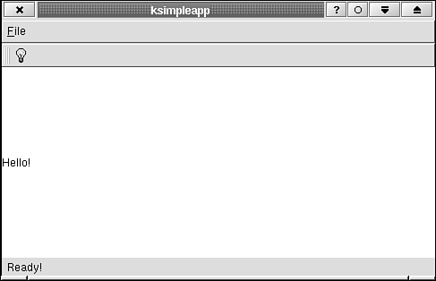
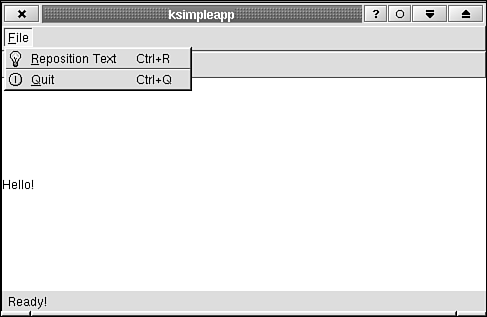
Before constructing the menubar, you need to create a QPopupMenu for each of the pull-down menus. In KSimpleApp you create one QPopupMenu for the File menu.

Line 23 adds the entry "Reposition" Text to the File menu.

The object reposition, used on line 23 and created on lines 14–17 is an action (an instance of KAction). It holds all of the information needed to create a menu entry or toolbar entry (see the next section, "The Toolbar"). Actions are a convenient way of packaging application functions with the user interaction needed to describe and activate them. (KActions are discussed further in Chapter 5, "KDE User Interface Compliance.") Lines 14–17, for example,


   1 
   2 KAction *reposition =
   3      new KAction ("&Reposition" Text, QIconSet(BarIcon ("idea")),
   4 :               CTRL+Key_R, this, SLOT (slotRepositionText()),
   5                 this);
   6 

The ampersand before the letter R makes it so that when the menu is visible, the user can press R to activate this menu entry. This feature is made known to the user by the widget by underlining the R.

The constants CTRL and Key_R are defined in qnamespace.h. Here they indicate that the Ctrl+R key combination will activate this menu entry whenever it is pressed by the user. These key combinations, called accelerators, allow the user to bypass the menubar/toolbar interface and access commonly used functions with simple keystrokes.

The icon, specified by QIconSet(BarIcon ("idea")) (a light bulb), will be placed to the left of the menu entry. (see Figure 2.6). When a function appears on the toolbar (as this one does, see the next section, "The Toolbar"), it should also appear as an entry in the menubar with the same toolbar icon next to the entry. This makes the correspondence between the two functions clearer to the user. The class QIconSet takes the icon specified by BarIcon("idea") and creates different icons that might be needed by the GUI: a large icon, a small icon, and grayed-out "disabled"-look icons. This is all taken care of by the libraries with no further necessary interaction.

The other two parameters to the KAction constructor: this and SLOT (slotRepositionText()) indicate that the method slotRepositionText(), which is a member of this instance of KSimpleApp, should be called whenever this action is activated. The details of just how such a feat can be accomplished—that feat being to call a method in a specific instance of a class seemingly arbitrarily—is discussed in Chapter 3. For now, note that this is accomplished with the Qt signal/slot mechanism.


Figure 2.6. You should place the same icon (a light bulb in this example) in the menubar as is used in the toolbar so that the user knows these are two ways of performing the same function.


The next line


   1 
   2 filemenu->insertSeparator();
   3 

appends a horizontal line to the pop-up menu. This is not an active GUI element; it simply serves to separate groups of functions. The KDE GUI design guidelines require this to be placed before the next entry in the menu, which is Quit. (These guidelines are discussed in Chapter 7.)

Note

Use standard names for standard menu entries (Chapter 7 has details). Important: Quit is the last entry on the File menu, not Exit!

The second argument passed to the KAction constructor when creating the Quit entry on lines 18-20 is KStdKeys::quit(), which is a static method of KStdAccel that returns the default accelerator key combination for the Quit action. All applications should have a Quit entry in the File menu, and Quit should always be associated with the accelerator key returned by KStdAccel::quit(). Using the same names and accelerators in all applications provides consistency, enabling the user to "Learn once and use everywhere" common application functions.

Notice that I use the new operator to create a QPopupMenu. This allows the object to survive even after you leave the current scope (that is, the KSimpleApp constructor) so that it can continue to be accessed by the menubar. An object created in the following way:


   1 
   2 QPopupMenu filemenu;
   3 

would be deleted after the constructor finished. It is deleted automatically, so you can forget about it unless you want to make changes to it later on.

Note

Create your widgets with new. They will be deleted by their parents, so you won't need to delete them.

Finally place the pop-up menu you created on the menubar with


   1 
   2 menuBar()->insertItem ("&File", filemenu);
   3 

menuBar()creates a KMenuBar widget the first time it is called. KTMainWindow is also responsible for deleting the KMenuBar when it is no longer needed.

This is the simplest method of handling a menubar. It is also possible to create a KMenuBar yourself and tell KTMainWindow to use it by calling


   1 
   2 void setMenu (KMenuBar *menuBar)
   3 

This can be useful if you need to switch to a new menubar.

2.4.2. The Toolbar

To place a button on the toolbar, use a plug() method just as you did with the menubar. The first call to toolBar() creates an instance of KToolBar. This class is deleted by KTMainWindow when it is no longer needed.

On line 29 you call reposition->plug(toolBar()) to put the light bulb icon on a button on the toolbar.

A short help text string, called a tooltip is associated with each toolbar button. It appears when the mouse cursor is placed over a button and left still for about a second. The string "Reposition Text", specified in the action definition (lines 14–17), is the tooltip string for this button.

You can put any widget you like on the toolbar—not just buttons. Two commonly used widgets, a line editor and a combo box (such as the URL-entry box with pull-down history used in a Web browser), are supported directly by KToolBar via insertLined() and insertCombo(), but you can use insertWidget() to add any widget you like.

2.4.3. The Status Line

The status line, or statusbar, is created and deleted by KTMainWindow in the same manner as the menubar and toolbar. Your first call to statusBar():


   1 
   2 statusBar()->message ("Ready!");
   3 

creates an instance of KStatusBar and puts the message "Ready!" at the bottom of the window on the status line.

Like KToolBar, you can place any widget on the status line by using the method KStatusBar::insertWidget(). This might be used for displaying a progress bar or an LED-style status indicator, for example.